
Last week we created a cube using SSAS. Now I am going to show you how your end users will connect to it using Excel and how they can use the data in a meaningful way while using their favorite tool (Excel).
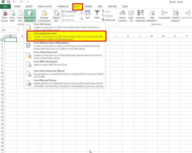
First thing we need to do is open Excel. Next go to the Data tab, and click the From Other Sources icon. In the dropdown choose From Analysis Services.
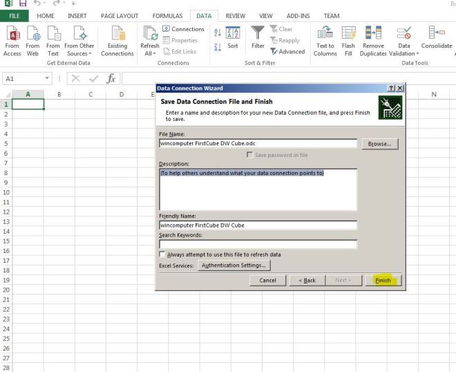
Now you need to provide the name of the server that your SSAS information is stored on. Mine is called WINCOMPUTER, select use windows authentication, then click next.

In the dropdown choose FirstCube since that is the one we created in the last lesson. In a production environment, you may have many to choose from. Click next.

Here you can name your cube connection, but I will stick with the default, and then click Finish.
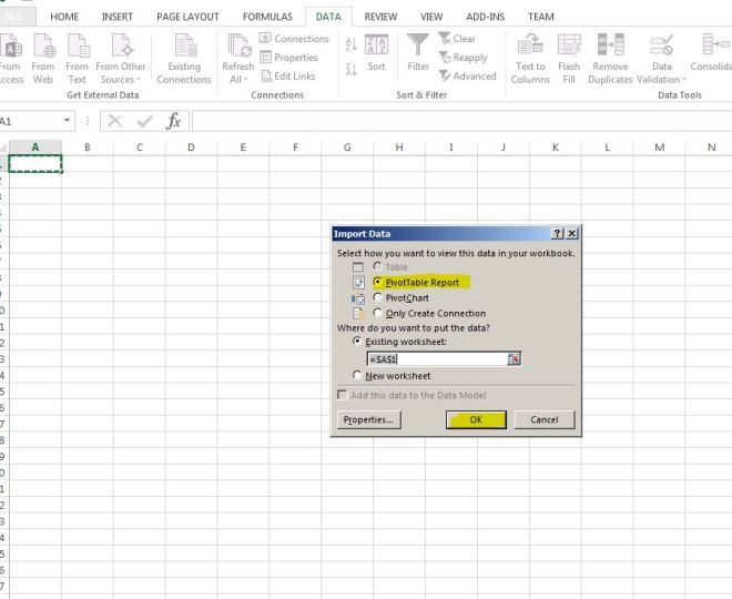
Finally it asks you how you want to view the workbook, pick PivotTable report and click OK.
That will then open this sheet up in Excel. On the right hand side, you will have the Facts and Dimensions that you created in your Cube. On the bottom of the right side, there are 4 boxes: Filter, Columns, Rows and Values. All you need to do is drag your facts and dimensions to those boxes and it will automatically populate the spreadsheet.

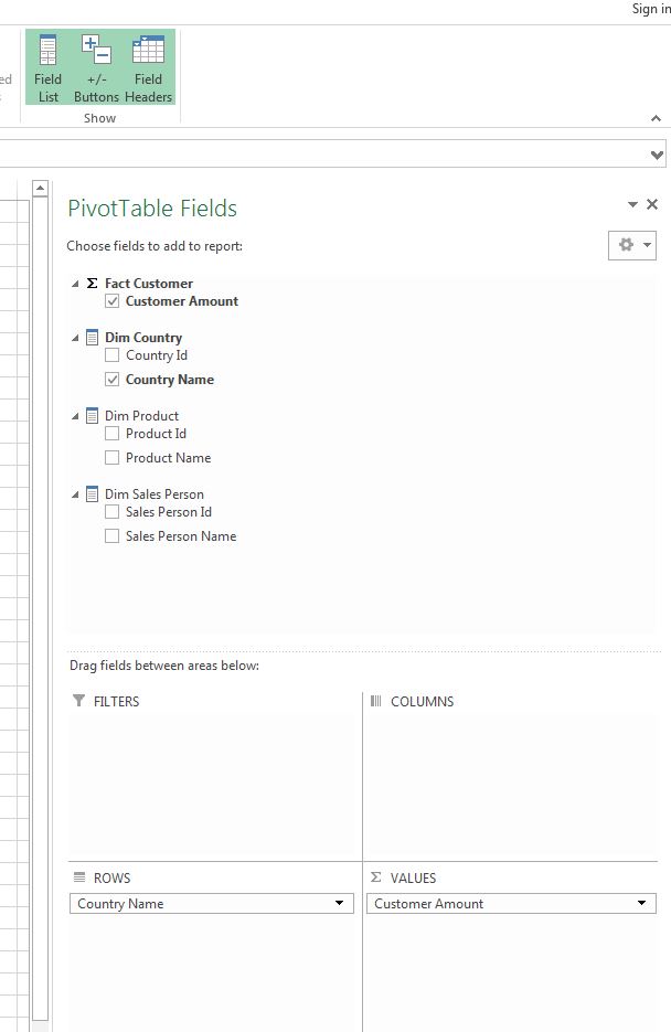
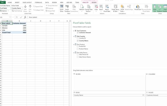
Here is where the fun starts. Click on CustomerAmount and drag it to the Values column on the bottom right (or you can just click the box). Then drag CountryName down to the Rows box.
You just created your first PivotTable!!! This shows by Country the total amount of sales.
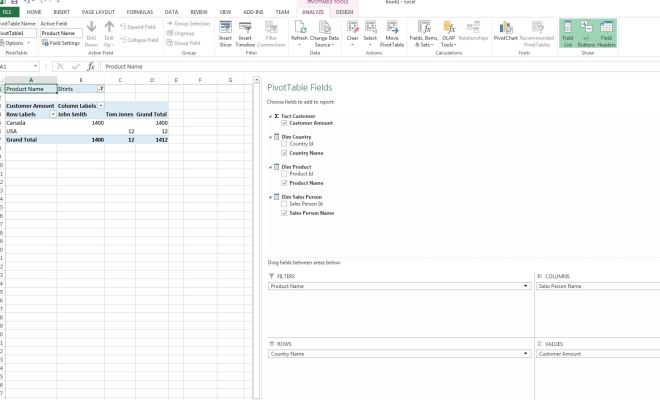
Now drag the ProductName and place it in the Columns box below. This breaks out the sales by country by product.

You can also filter on items. Drag the ProductName and place it in the Filters Section. In the spreadsheet Column B row 1, click the drop down and choose Shirts.

That will show only the values for Shirts.

Now drag SalesPersonName and put it in the Columns section. This will show you how much in sales each Sales Person had.
Pretty slick, huh? Feel free to play with this for a while, choosing different fields and placing them in different sections to see how the Pivottable reacts.
Allowing your users to connect to the Cube will greatly improve their productivity. This allows them with very little technical knowledge, to pull the information they need to do their analysis.
The next posting will show how to create a Time Series Dimension and how that will improve our cube by allowing analysis by month/quarter/years, etc.
