
We have created plenty of SSRS reports, but can you add a graph to one to create some visuals? You sure can! Read on.
You can create different visuals within a SSRS report. If you have ever used Excel, the process is pretty similar.
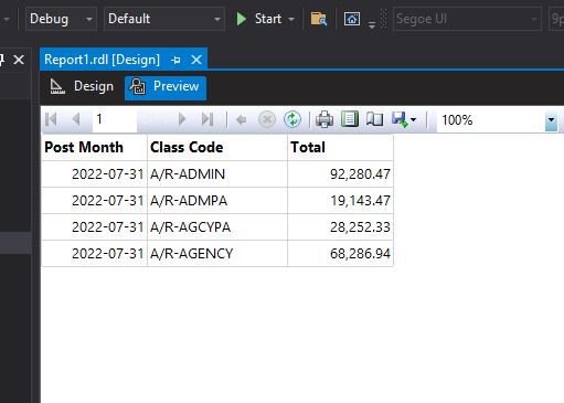
Here we have a basic report with a simple query.

This creates a basic looking report.
Nice, but lets spice it up a bit by putting a graph in the report to show the proportions of each value.
From the Toolbox, select and drag on to your report a Chart.

That will then ask you to select a chart type. I like pie, so I will choose a basic pie shape and then press OK.

That puts the framework in. Now we need to configure the different sections with the results from our query.

There are 3 sections to modify: Values, Category Groups and Series Groups.

To add our query values, you need to press the + sign that “add’s field”.
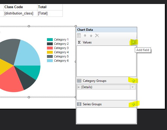
For Values, I pick summing the Total column. For the groupings, I choose Distribution Class.

Running that shows a nice looking pie graph. It shows each Class Code and the size is determined by the Total for each Class Code. AR/Admin has 92,280 as a value and shows as the biggest color in the graph.

If we want the Totals to show in the key, we need to populate the Series Groups section of the configuration with the Totals.

Now when we preview the report, the Total amounts are in the key.

It is easy to add charting to your SSRS reports. Feel free to experiment with the other types.
To read more about charting, here are some documentation links. https://learn.microsoft.com/en-us/sql/reporting-services/report-design/charts-report-builder-and-ssrs?view=sql-server-ver16 or https://learn.microsoft.com/en-us/sql/reporting-services/report-design/pie-charts-report-builder-and-ssrs?view=sql-server-ver16
